From Boring to Bold: Branding Your SharePoint Site with FusePoint
By Khoa Q|Digital Workspace Solutions
 When Generic SharePoint Becomes Your Organization's Digital Showpiece
One mid-sized financial services firm faced a challenge: their SharePoint intranet—the digital face for 800+ employees—looked bland and uninspired. Default Microsoft styling sent the wrong message to employees, undermining engagement and internal communication.
With FusePoint’s branding web parts, they transformed their environment into a professional, visually engaging platform—without hiring designers or developers.
The Hidden Cost of Generic Digital Environments
First impressions happen in milliseconds. Bland SharePoint sites subconsciously communicate bureaucracy, inefficiency, and low priority for employee experience. The result? Reduced adoption, missed communications, and fragmented collaboration.
The "Before" Reality: When SharePoint Looks Like SharePoint
- Visual Monotony – Default colors, no visual hierarchy, and lifeless layouts.
- Brand Disconnect – No connection to the company’s external brand identity.
- Attention Competition – Critical policy updates blended with routine announcements.
- Employee Perception Issues – Seen as outdated, despite valuable content.
The FusePoint Transformation: Professional Branding Made Simple
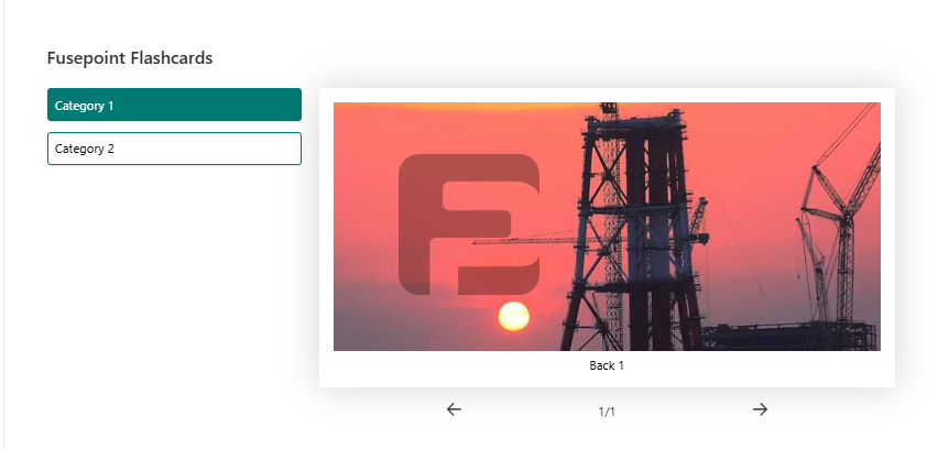
New Banner Web Part
- Full-width, brand-colored banners with typography control.
- Contextual messaging styles for HR, executive, and team spaces.
- Visual emphasis for high-priority updates.
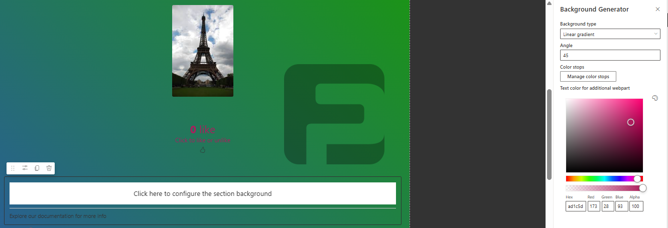
Background Generator Web Part
- Professional CSS gradients integrated with brand colors.
- Section-specific backgrounds for hierarchy and clarity.
Advanced Text Web Part
- Custom typography that matches marketing materials.
- Visual hierarchy with headings, highlights, and callouts.
- Consistent brand voice across all internal communications.
Real-World Example: Executive Communication Upgrade
Before FusePoint:
– Default header, plain background, standard fonts.
– 45-second average reading time, 23% read completion.
After FusePoint:
– Professional banner with CEO image and brand colors.
– Gradient backgrounds, advanced typography, and highlighted key points.
– 3 min 15 sec reading time, 78% completion rate.
Strategic Color Psychology
- Trust-Building Pages – Deep blues and stable gradients.
- Innovation Spaces – Dynamic, energizing color transitions.
- Authority Content – Strong contrast for compliance and policy updates.
- Community Pages – Warm colors to encourage participation.
Quantified Impact
- 340% increase in intranet page views.
- 82% policy read-through (up from 31%).
- 65% training completion rate improvement.
- 45% higher “invests in employee experience” survey ratings.
Technical Excellence Without Complexity
- No-code customization for marketing and communications teams.
- Brand palette management for consistent visuals.
- Optimized for speed and mobile responsiveness.
Step-by-Step Branding Implementation
- Visual Strategy – Audit, define brand palette, identify key pages.
- Banner & Background – Deploy impactful visuals on priority pages.
- Typography & Content – Implement advanced text styling templates.
- Refinement & Expansion – Use analytics to guide rollout.
Beyond Internal Impact
- Client Portals – Professional branding for shared spaces.
- Recruitment Advantage – Positive first impressions for candidates.
- Vendor & Partner Spaces – Consistent professionalism across touchpoints.
Your ROI Revolution Starts Here
Choosing ready-to-deploy isn’t just a budget decision—it’s a strategy for faster value, lower risk, and sustained advantage.
Start your 30-day free trial – No credit card required, full access, and expert setup support.
