The FusePoint Modal web part provides an easy way to display pop-up modals within SharePoint. It enhances user interaction by allowing content, messages, or notifications to be displayed in a structured pop-up format.
Features
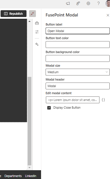
Customizable Modal Windows: Users can set modal size, colors, and button styles.
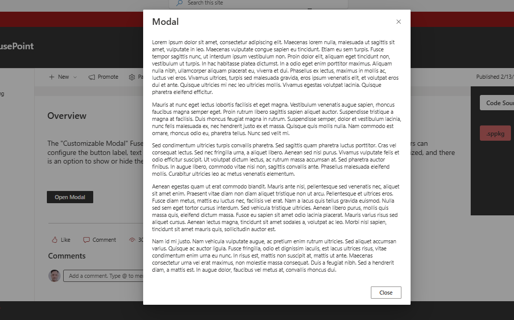
User-Friendly Activation: A button triggers the modal for easy interaction.
Seamless SharePoint Integration: Works natively within SharePoint Online.
License Validation: Ensures authorized usage.
Content Management: Supports formatted text and HTML within the modal.
Close Options: Includes a close button for easy dismissal.
How to Use
Adding the Web Part
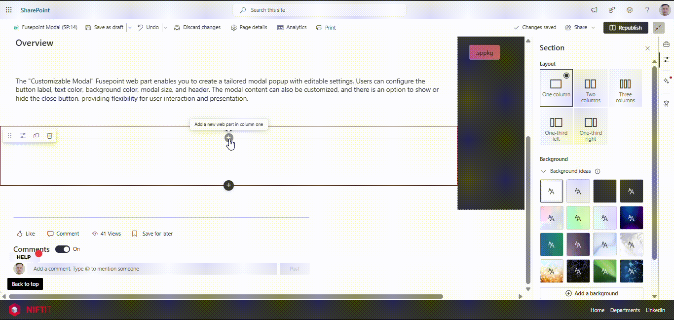
Navigate to the SharePoint page where you want to display a modal.
Click Edit Page and select Add a Web Part.
Search for Fusepoint Modal and add it to the page.
Opening and Closing the Modal
Click the trigger button to display the modal.
Click the close button inside the modal to dismiss it.
Customizing Modal Appearance
Admins can configure:
Button Label: Customize the trigger button text.
Button Colors: Adjust background and text colors.
Modal Header: Set a title for the modal window.
Modal Size: Choose from Small, Medium, or Large.
Content Formatting: Enter formatted text or HTML.
Close Button Display: Enable or disable the close button.
Benefits
Improves Communication: Delivers important messages in a structured way.
Enhances User Experience: Provides an interactive and professional display.
Flexible Customization: Allows branding and content adjustments.
Simple Deployment: Easy to enable and configure within SharePoint.
Conclusion
The FusePoint Modal web part is a versatile tool for displaying pop-up modals in SharePoint. It offers easy customization, seamless integration, and an effective way to present important content dynamically.
