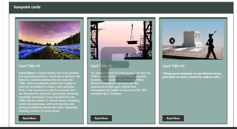
The FusePoint Cards Web Part is a customizable card-based content display tool designed for SharePoint. It enables users to create visually appealing card layouts with customizable colors, text, images, and interactive elements like buttons and links.
Features
Per-Web Part Styling (Instance Scoped): Multiple Cards web parts on the same page can have different styles without impacting each other
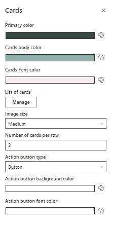
Primary Color (Independent): Set a primary/accent color separately from each card background color
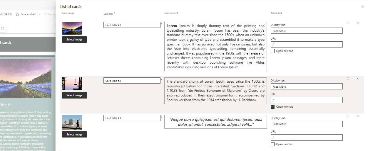
Per-Card Colors: Customize background, border, title/content/link colors (each card can be different)
Per-Card Hover Styles: Customize hover background and hover text colors per card
Borders: Configure border color per card, border position (all / top / right / bottom / left / none), and border size (px)
Typography: Set font size for card title, card content, and action link/button
Action Button Type: Choose between Link, Button, or Entire card (full-card click)
External Links: Supports external URLs (include https:// or http://)
Target Audiences: Show cards only to selected users and/or mail-enabled security groups
Drag & Drop Ordering: Reorder cards directly in Edit mode
Optional Container: Option to show/hide the web part container wrapper
Images: Optional card image with image size control (default image size is Hidden)
How to Use
Adding the Web Part
Navigate to the SharePoint page where you want to display cards
Click Edit Page and select Add a Web Part
Search for FusePoint Cards and add it to the page
Configuring Cards
Set the header title for the card grid
Choose a primary color theme for the display
Adjust the number of items per row for your preferred layout
Add card details including title, description, and optional image
Choose Action button type (Link / Button / Entire card) and configure link behavior
(Optional) Set Target audiences per card (users and/or mail-enabled security groups)
Reorder cards via drag & drop in Edit mode
Customization Options
Visual Styling: Per-web part and per-card colors (including hover styles)
Border Styling: Border size (px), border position (applies to all cards), and border colors (per card)
Typography: Font size controls for title, content, and action link/button
Layout Flexibility: Responsive grid that adapts to different screen sizes
Content Variety: Mix and match cards with different content types
Interaction Choices: Choose between Link, Button, or Entire card click behavior
Targeting: Card visibility controlled via target audiences
Image Control: Fine-tune image display settings for each card
Benefits
Enhanced Visual Appeal: Creates engaging, modern content displays
Improved Content Discovery: Makes information more accessible
Brand Consistency: Matches organizational color schemes and styles
Responsive Design: Works well on all device sizes
Easy Maintenance: Simple to update and modify as needed
Conclusion
The FusePoint Cards web part transforms standard SharePoint content into visually compelling card displays. With its comprehensive customization options and intuitive configuration, it enables organizations to present information in a more engaging and user-friendly format.
Notes
Entire card clickability: When using Action button type = Entire card, the action button is hidden and the full card becomes the click target.
External URLs: For external links, include the protocol, for example https://google.com.
Border size (px): Border sizes are configured as a number; very large values may not apply (recommended range: 0-5).
Hide container: Use this option if you want the cards to render without the outer web part wrapper/container.
Target Audiences + Reordering: Drag & drop ordering is done in Edit mode. In Edit mode, all cards are visible to allow reordering; to verify targeting, save and switch to View mode.
Image visibility: A card image is shown only when you select an Image size (default is Hidden).
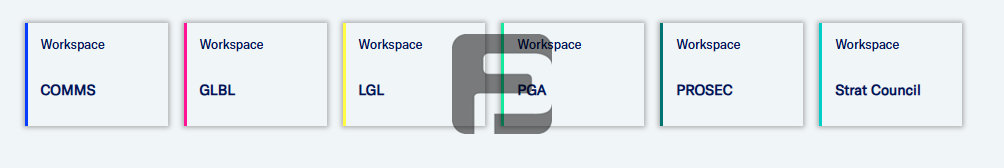
Example: Navigation Tiles
The FusePoint Cards web part can also be used as a simple navigation tile grid (for example: departments, key resources, or landing pages). For the best “tile” experience, use Action button type = Entire card so the whole tile is clickable, and keep the card content short (title + optional subtitle).
Try FusePoint for Free!
No credit card required.
FusePoint
The perfect addition to your SharePoint environments.
