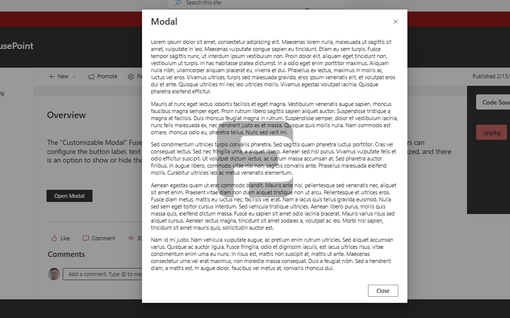
The FusePoint Modal web part enables professional pop-up dialogs within SharePoint pages. It provides a customizable solution for displaying important messages, forms, or notifications in an interactive overlay format.
Features
Flexible Sizing: Small, medium, and large modal options
Custom Trigger Button: Configurable button text and styling
Content Support: Formatted text and HTML content display
Close Options: Multiple dismissal methods (button, overlay click)
SharePoint Integration: Native functionality within SharePoint Online
Security: License validation for authorized usage
How to Use
Adding the Web Part
Edit your SharePoint page
Select "Add a Web Part" from the ribbon
Choose FusePoint Modal from the web part gallery
Position where the trigger button should appear
Configuring the Modal
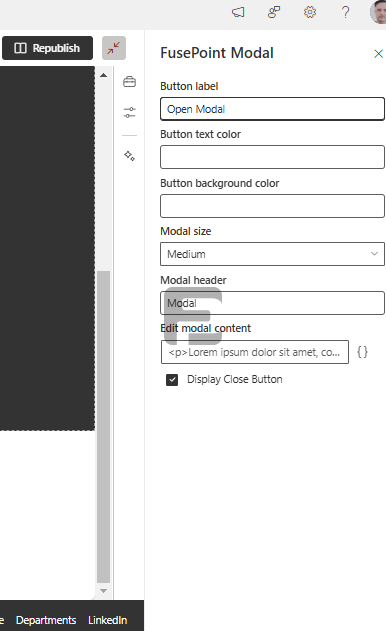
Set modal title and content in properties
Choose preferred size (Small/Medium/Large)
Customize trigger button text and colors
Configure close button behavior
Save to apply changes
User Interaction
Click configured button to open modal
View content in the overlay window
Close via X button or clicking outside
Customization Options
Visual Styling: Adjust colors and fonts
Size Selection: Optimize for different content types
Button Design: Match your site's branding
Content Formatting: Use HTML for rich content
Behavior Settings: Control dismissal methods
Benefits
Professional Presentation: Clean, modern dialog windows
Improved Engagement: Focuses user attention
Flexible Content: Supports various message types
Easy Implementation: Simple configuration process
Consistent Experience: Matches SharePoint design
Conclusion
The FusePoint Modal web part enhances SharePoint communication with professional pop-up dialogs. Its combination of customization options and ease of use makes it ideal for notifications, forms, and important messages.
Try FusePoint for Free!
No credit card required.
FusePoint
The perfect addition to your SharePoint environments.
